自訂checkbox, radio button的css

以前需透過label標籤配合css “+” selector來自訂checkbox與radio button的樣式,但現在已可透過將input設定

appearance: none
appearance: none 來將input視為一個普通的容器,更直覺地自訂radio button與checbox的外觀。以下是我們要完成的樣子:

看看實際的結果

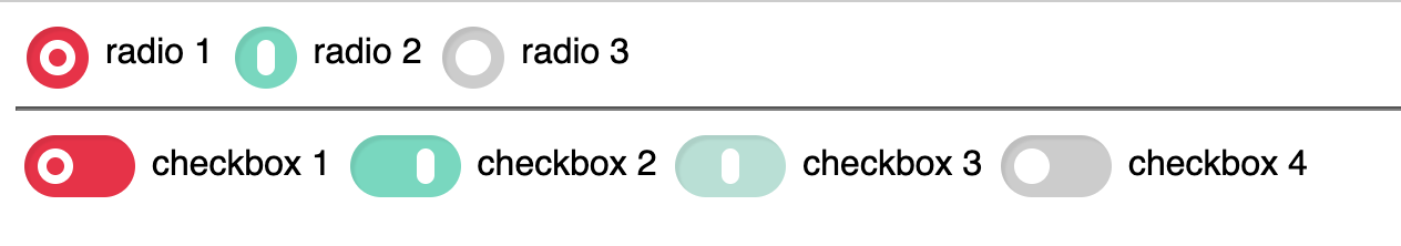
我們的目標是以不同底色來區分不同狀態,紅色底色代表未選取 (off),綠色為已選取 (on),灰色是disabled。第三個淺綠色的checkbox是未確定狀態 (indeterminate) 的checkbox。並且給予不同的圖形來幫助識別不同的狀態。最後再以動態串連圖形變化。可以先點上方連結看看效果。

我們先來為input設定最重要的css property:

appearance: none
appearance: none ,然後checkbox或radio button會變成一個普通的容器,就像一個普通的inline容器一樣,可以設定
display: inline-block
display: inline-block 讓他成為一個可指定寬高的容器。然後便可以開始設定
padding
padding, 背景色等等。

至於圖像的部分,我們則可以用:

before
before偽元素來在input內添加圖像。我們用
border
border
border-radius
border-radius屬性,讓它在off/on狀態顯示類似0與1的圖像。

input有三個偽類也需要我們來處理一下:

:checked
:checked 代表已選取的狀態,
:disabled
:disabled也就是input標籤為disabled狀態,
:indeterminate
:indeterminate則代表checkbox獨有的不確定狀態。將對應的顏色分別設置完畢後,便完成一個獨特的radio button與checkbox ui囉!

以下是上方範例的程式碼:

<!DOCTYPE html>
<html lang="en">
<head>
<meta charset="UTF-8">
<meta name="viewport" content="width=device-width, initial-scale=1.0">
<title>Document</title>
<link rel="stylesheet" href="style.css">
</head>
<body>
<input type="radio" name="radio_group_1" id="radio_1" value="1">
<label for="radio_1">radio 1</label>
<input type="radio" name="radio_group_1" id="radio_2" value="2" checked>
<label for="radio_2">radio 2</label>
<input type="radio" name="radio_group_1" id="radio_3" value="3" disabled>
<label for="radio_3">radio 3</label>
<hr>
<input type="checkbox" name="check_1" id="check_1" value="1">
<label for="check_1">checkbox 1</label>
<input type="checkbox" name="check_2" id="check_2" value="2" checked>
<label for="check_2">checkbox 2</label>
<input type="checkbox" name="check_3" id="check_3" value="3">
<label for="check_3">checkbox 3</label>
<input type="checkbox" name="check_4" id="check_4" value="4" disabled>
<label for="check_4">checkbox 4</label>
<script>
// 將第三個checkbox設為未確定
document.querySelector('[name=check_3]').indeterminate = true
</script>
</body>
</html>
view raw index.html hosted with ❤ by GitHub
:root {
--inputDisabled: #ccc;
--inputOn: #7cd7be;
--inputIndeterminate: #badfd5;
--inputOff: #e43349;
--inputTransitionDuration: 0.4s;
--inputTransitionEase: cubic-bezier(0.34, 1.56, 0.64, 1);
font-family: sans-serif;
}
input[type=checkbox],
input[type=radio] {
vertical-align: middle;
}
input[type=checkbox]:focus,
input[type=radio]:focus {
outline: none;
}
input[type=checkbox],
input[type=radio],
input[type=checkbox] + label,
input[type=radio] + label {
cursor: pointer;
}
input[type=checkbox]:disabled,
input[type=radio]:disabled,
input[type=checkbox]:disabled + label,
input[type=radio]:disabled + label {
cursor: not-allowed;
}
input[type=checkbox],
input[type=radio] {
display: inline-block;
padding: 6px;
-webkit-appearance: none;
appearance: none;
border: 0;
border-radius: 100px;
background: var(--inputOff);
transition: var(--inputTransitionEase);
box-shadow: inset 2px 2px 1px #0001;
}
input[type=checkbox]:before,
input[type=radio]:before {
content: '';
display: block;
width: 8px;
height: 8px;
border-radius: 100px;
border: 4px solid white;
transition: var(--inputTransitionDuration) var(--inputTransitionEase);
}
input[type=checkbox]:checked,
input[type=radio]:checked {
background: var(--inputOn);
}
input[type=checkbox]:checked:before,
input[type=radio]:checked:before {
width: 0;
margin-left: 24px;
}
input[type=checkbox]:indeterminate {
background: var(--inputIndeterminate);
}
input[type=checkbox]:indeterminate:before {
width: 0;
margin-left: 15px;
}
input[type=checkbox]:disabled,
input[type=radio]:disabled {
background: var(--inputDisabled);
}
input[type=checkbox]:disabled:before,
input[type=radio]:disabled:before {
background: white;
}
input[type=checkbox] {
width: 50px;
}
input[type=radio] {
width: 28px;
}
input[type=radio]:checked:before {
margin-left: 4px;
}
view raw style.css hosted with ❤ by GitHub

發佈留言

發佈留言必須填寫的電子郵件地址不會公開。 必填欄位標示為 *

這個網站採用 Akismet 服務減少垃圾留言。進一步了解 Akismet 如何處理網站訪客的留言資料