善用 display: grid 來處理排版真的非常方便,不但可以簡化html巢狀結構,在處理RWD的時候,也增加了更多排版的彈性跟可能性。例如可以用 grid-template-areas 來隨意調整排版的位置順序等等。
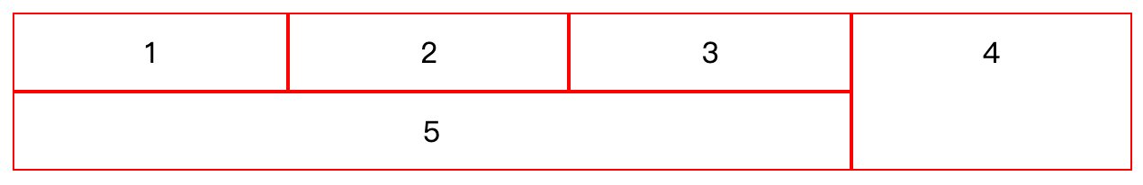
說到 colspan 的話,上述提到的 grid-template-areas 也可以輕鬆達到這個需求,例如以下範例:
This file contains bidirectional Unicode text that may be interpreted or compiled differently than what appears below. To review, open the file in an editor that reveals hidden Unicode characters.
Learn more about bidirectional Unicode characters
<style> | |
.grid { | |
display: grid; | |
grid-template-areas: "col-1 col-2 col-3 col-4" "col-5 col-5 col-5 col-4"; | |
} | |
.col-1 { | |
grid-area: col-1; | |
} | |
.col-2 { | |
grid-area: col-2; | |
} | |
.col-3 { | |
grid-area: col-3; | |
} | |
.col-4 { | |
grid-area: col-4; | |
} | |
.col-5 { | |
grid-area: col-5; | |
} | |
</style> | |
<div class="grid"> | |
<div class="col-1">1</div> | |
<div class="col-2">2</div> | |
<div class="col-3">3</div> | |
<div class="col-4">4</div> | |
<div class="col-5">5</div> | |
</div> |
可以得到以下結果:
但這個作法只限於在父層,並且內部的數量是固定的。也就是說如果今天是一個無法預估數量的列表型態,就無法用這個做法。
假設現在有一個商品列表,排列為左右兩欄的方式向下排,商品數量不固定,並且在中間需要插入一則廣告,廣告寬度為左右兩欄的寬度,那該怎麼辦呢?
我們可以在子層,也就是設為 grid 的內層,使用 grid-column 這個 property,例如以下範例:
This file contains bidirectional Unicode text that may be interpreted or compiled differently than what appears below. To review, open the file in an editor that reveals hidden Unicode characters.
Learn more about bidirectional Unicode characters
<style> | |
.grid { | |
display: grid; | |
grid-template-columns: 1fr 1fr; | |
} | |
.ad { | |
grid-column: 1 / span 2; | |
} | |
</style> | |
<div class="grid"> | |
<div>1</div> | |
<div>2</div> | |
<div>3</div> | |
<div>4</div> | |
<div class="ad">ad</div> | |
<div>5</div> | |
<div>6</div> | |
<div>7</div> | |
<div>8</div> | |
<div>9</div> | |
<div>10</div> | |
<div>11</div> | |
<div>12</div> | |
</div> |
可以得到以下結果:
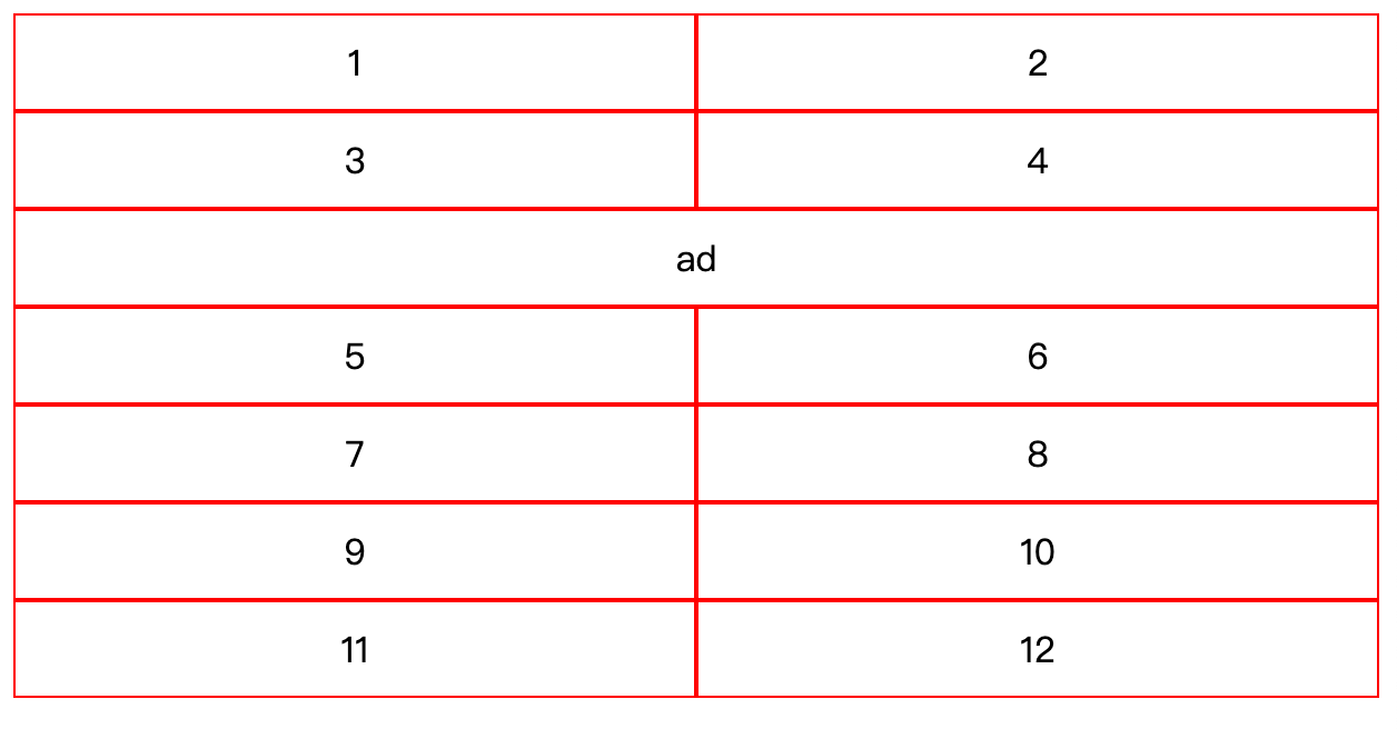
所以我們只要將廣告安排在奇數欄,就可以順利呈現。若廣告不慎安插在複數欄時,也會直接在下一列呈現,不會破壞 grid 欄數設定,相當方便。
grid-column 是 grid-column-start 跟 grid-column-end 前後值以斜線分隔的簡寫方式,所以也可以寫成:
This file contains bidirectional Unicode text that may be interpreted or compiled differently than what appears below. To review, open the file in an editor that reveals hidden Unicode characters.
Learn more about bidirectional Unicode characters
.ad { | |
grid-column-start: 1; | |
grid-column-end: span 2; | |
} |
span 代表的是從start的欄位開始算,要合併到的欄位的末端,這樣講感覺有點難懂,也就是範例中第二欄的右邊界。如果只寫2的話,是代表第二欄的左邊那條線。所以end也可以寫成 3,變成 grid-column: 1 / 3,會得到一樣的結果。